One of the easiest ways to refresh a room is with a coat of paint. Repainting may sound simple until reality hits: choosing the ideal color can be overwhelming. With so many shades available, which colors should you choose? What if you change your mind once the paint has dried? What happens if it doesn't turn out the way you like? It can be difficult to know where to begin, especially if you're renovating room by room or preparing to put your house on the market.

Selecting the right paint color can transform any space, setting a mood and style that reflects your personality and the room's purpose. Here's a straightforward guide to choosing paint colors when updating your space.

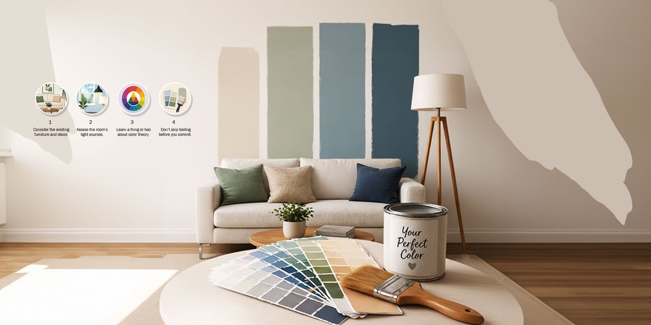
When choosing a paint color to give new life to your space, one of the most essential things to consider is the existing elements. Your new shade should complement the current furniture, flooring, fixtures, and even most of your accessories. For instance, if the furniture and decor in the room are mostly neutral, you may want to experiment with bold, vibrant colors to make a statement.
On the other hand, if your home already has a lot of bold, bright colors, choosing a more neutral hue will balance things out and create a cohesive look. If you have a statement piece of artwork or furniture in the room, make sure your selected paint color will enhance or contrast with it without overwhelming the space.
For a complete overhaul of a room, wait until you've finalized most of the furnishings before painting the walls. Or pick neutral colors that are versatile and can easily adapt to different styles and decor updates. Remember that paint is a lot easier to change than furniture, so it's better to wait than regret it later.

It's easy to fall for a paint color when you see it at the store. Unfortunately, that color won't look quite the same once it's on your walls because of one essential factor: light.
Paint color and light have a complex relationship. A color may look different depending on the light it's exposed to. Natural light changes throughout the day, while artificial light sources also affect how colors are perceived.
Natural Light
The amount of natural light a room receives is an important factor in selecting the perfect shade for your walls. A room that receives a lot of sunlight can handle bold, bright paint colors, whereas a room with less natural light may benefit from a lighter, more neutral color.
Check which direction your room faces: north, south, east, or west. Consider using Google Earth if you aren't sure. North-facing rooms tend to be cooler since they receive less direct sunlight throughout the day. Compensate by painting the room in warmer colors to keep it from feeling too cold. Conversely, south-facing rooms get more light throughout the day and are often the sunniest spots in the home. Choose cooler tones that look vibrant in bright sunlight but won't make the room feel too energetic.
East-facing rooms get the most light in the morning, so choose a warmer palette to offset the lack of natural light if you use the room mostly in the evening. On the other hand, west-facing rooms benefit from sunset rays and have a warm glow in the evening. Choose cooler paint colors to tone down the light, especially if you use the room most around that time.
Artificial Light
Similar to natural light, the type of artificial light you use in your room affects how your color scheme looks and feels. Fluorescent lights are generally cooler and enhance blues and greens. Incandescents often cast a yellow glow and enhance warm colors such as reds, yellows, and oranges. LED lights are more flexible than other bulb types and look good with most paint colors. Halogen lights, meanwhile, closely resemble daylight and tend to give the truest color.
When choosing paint colors, turn on various light sources in the room to see how they affect the hues. If you are in the middle of a renovation, it might be better to have the lights installed before you paint.

Knowing the basics of color theory can guide you in choosing the perfect paint color for your home. Color theory explores the relationship between colors and the psychological effects of certain combinations. Familiarizing yourself with the color wheel and concepts like complementary and analogous colors will set a solid foundation for your color selection journey.
For instance, warm colors like reds, oranges, and yellows create a cozy and energetic feel. Blues and greens are known for their calming effect. Neutral colors like whites, grays, and beiges provide balance and versatility. By learning a thing or two about color theory, you can appreciate how colors set the mood in a space and create contrasts using complementary colors.

Since paint colors can look different on different surfaces, in different lighting conditions, and at different times of day, it's a good idea to test the color before committing to a whole room. Skip the tiny one-inch swatches from the paint fan deck and go for larger paint sample sheets, which give you a better sense of the shades and help narrow down your choices. Once you've shortlisted the colors, get small sample jars so you can paint a large enough section of your space to view in different lighting conditions throughout the day. While this step may feel tedious, it can help you avoid surprises and make sure the hue matches your expectations.